Timeline: 1 Month (Summer 2017)
Category: UX Design
Type: iOS App
Tools: Pen & Paper, Google Forms, Sketch, InVision
Overview
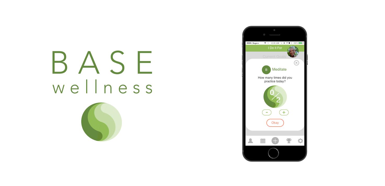
SierraSil is a Vancouver based company that produces natural mineral supplements for joint pain and inflammation. In 2012 they create the app BASE Wellness as a platform to sell their products and promote a healthy lifestyle. Their app aimed to have users journal their health goals and progress but with no feedback to keep users engaged usage dropped off. Additionally, SerraSil did not provide updates or maintain the app and it soon became dormant.
The Goal
After our first meeting with the stakeholders we defined 4 key goals for the project. SierraSil wanted to:
Engage with customers
Promote healthy living
Retain exiting customers
Create a platform to promote and soft sell their supplements
These were the same primary goals set by SierraSill in 2012 with their original BASE Wellness app. Now our objective was to take these goals and rethink the BASE app to be more successful in keeping users engaged.
Research
For this project the team was made up of myself and 2 other designers creating the UX. A fourth designer was responsible for creating the UI. Having had no prior knowledge of SierraSil or health journaling apps it was important for us to research current, successful journaling apps and what services they offer. We found that the vast majority of the apps focused heavily on physical fitness and less on general wellbeing and mental health. By setting our focus on both physical and mental health meant we could have a relatively untapped market. This holistic view of health aligned closely with SierraSil’s BASE formula: Balance, Activity, Supplements and Energy.
We found that the vast majority of the apps focused heavily on physical fitness and less on general wellbeing and mental health
By setting our focus on both physical and mental health meant we could have a relatively untapped market.
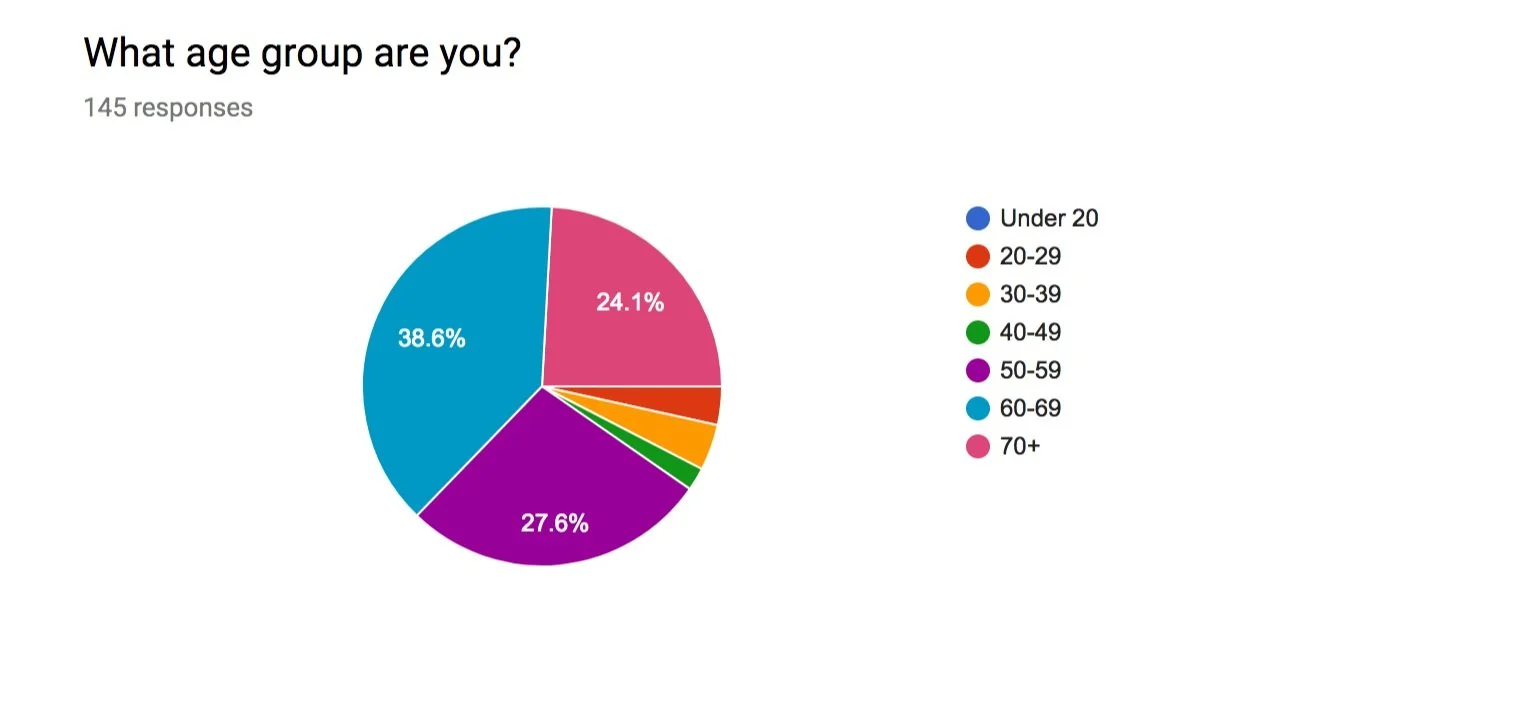
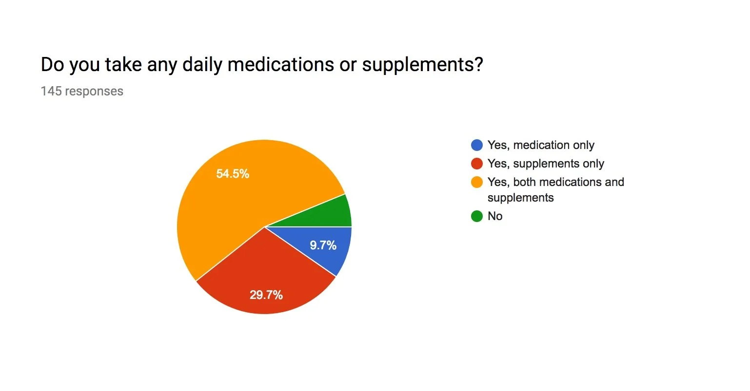
With our knowledge of the competitors, we then began to research on our primary users. We conducted in person interviews and sent out an online survey though SierraSil’s email list. We discovered that about 84% of respondents were already taking supplements and that nearly 65% of our users were between 60-70+ years of age. Our first realization was that those in the 70+ age category may not be tech savvy or confident in their ability to navigate apps. With this in mind we made a concerted effort to keep simplicity as the key to users being able to adopt and enjoy the app. Additionally, with so many potential users already taking supplements meant the BASE app was a prime pipeline for SierraSil to stay engaged with its customers. SierraSil was prepared to offer free products as rewards for those who used their app. Our plan was to have users create one goal per week, record their progress for points and finally redeem accumulated points for products. This approach meant we could hit all our goals for the project.
Our plan was to have users create one goal per week, record their progress for points and finally redeem points for SierraSil Products. This approach meant we could hit all our goals for the project.
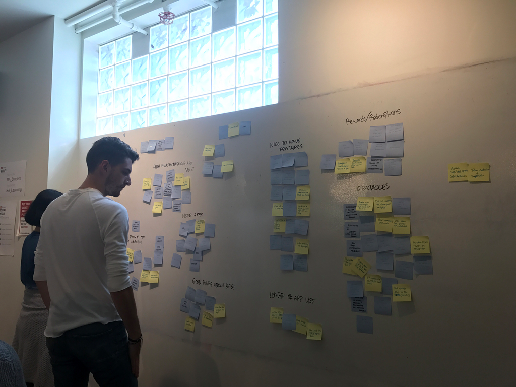
Affinity diagram created from user interview and survey feedback
Wireframing
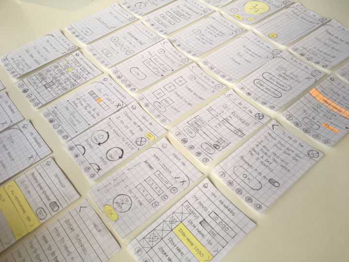
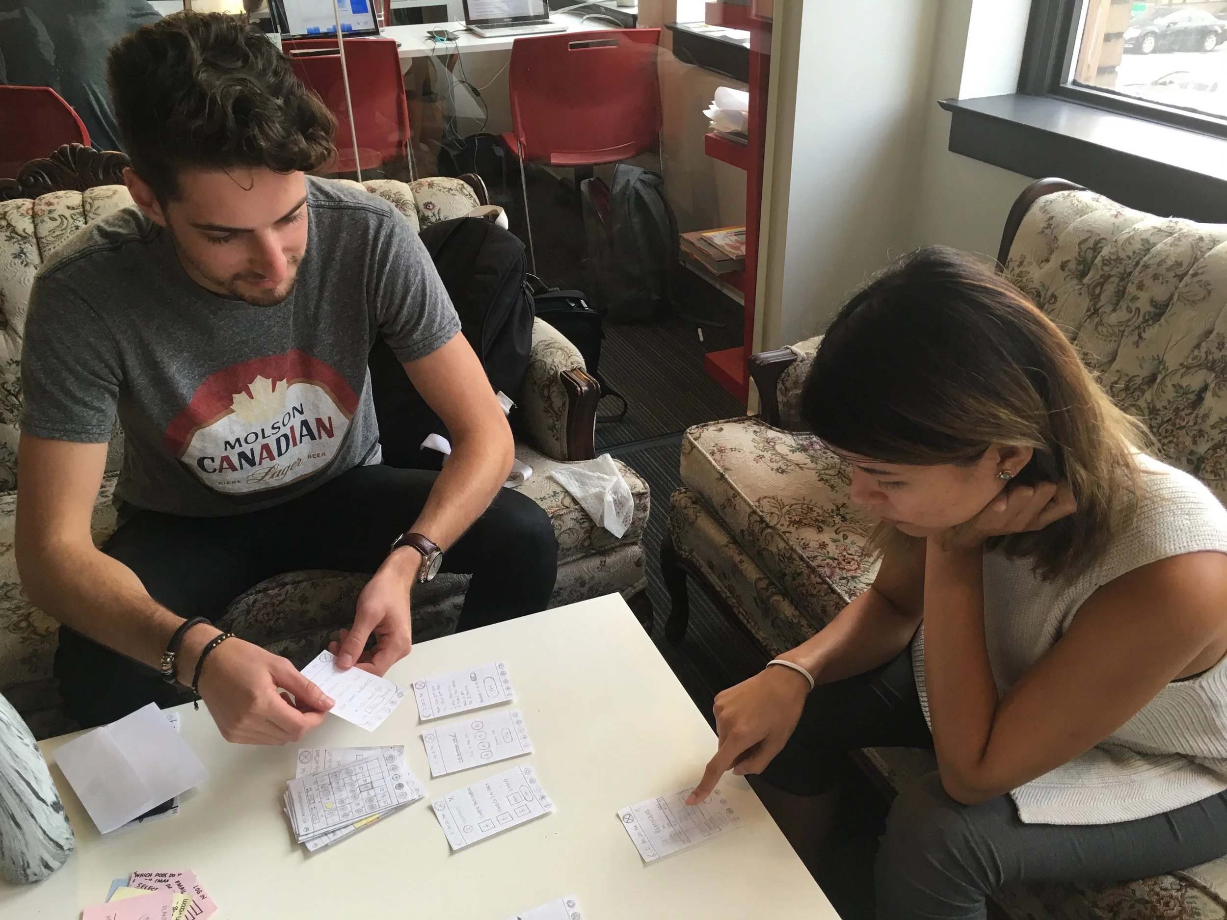
After our research was complete we were ready to start designing. We first had a design studio session to get as many ideas out on paper as possible. Our approach was to have each member of the UX team design the same page individually and then come back together and compare our designs. In doing this we achieved a high variety of styles and layouts in which we could pick and choose the best features to include. Using our paper wireframes we conducted usability testing on our classmates who were the most easily available in the time constraints of this project. However, we asked our younger participants to put themselves in the shoes of an older users and from that we gained some helpful insights. Important takeaways from user testing was to pay special attention to how big the type and buttons were. An older user may have troubles with vision and dexterity. Another important point was that some of our choices for icons were not as intuitive as we expected.
Important takeaways from user testing was to pay special attention to how big type and buttons were as an older user base may have troubles with vision and dexterity.
Another important feedback point was that some of our choices for icons were not as intuitive as we expected..
Paper wireframes
Testing our design with our colleagues
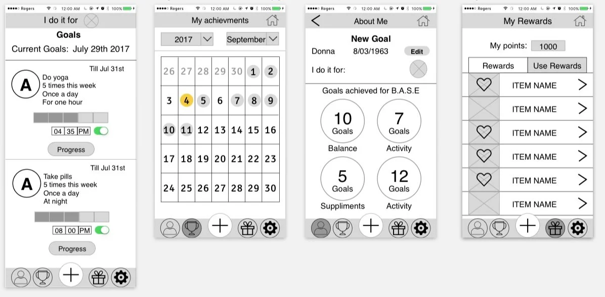
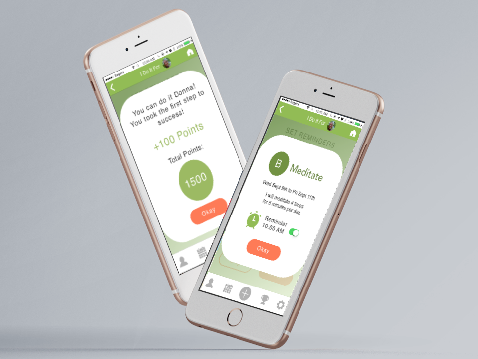
After iterating on our designs and incorporating all this feedback we were ready to go digital. We created wireframes in Sketch and conducted another round of usability testing with a prototype made in InVision. At this point we handed off our wireframes to our UI colleague to finalize the mockups.
Mid fidelity wireframes
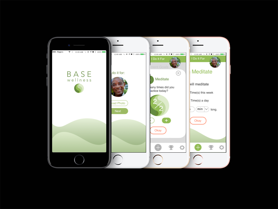

My takeaway from BASE
This project presented a unique opportunity to work on an app designed for an older audience. We really had to put ourselves into different shoes considering things we do not normally think of such as button size, inability to clearly see and dexterity with touch keyboards.
Because this was a 4 week project and Sierrasil did not have the budget to develop this app we were never able to test our app in the real world. However, had SierraSil developed this app we feel that we could have encourage people to achieve simple weekly goals while also giving SerraSil a way to engage with their customers and get more of their products in peoples homes.

